Visual Contrast
Posted by Robin Childs on August 5, 2013 News | Tags: advice, comics, film, storytelling, tips, visual storytelling, writing | No commentsWhy we need contrast
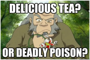
We crave contrast because it is necessary for our survival. Telling safe from unsafe, normal from abnormal…delicious tea from deadly poison. Our ability to quickly pick out things that are different or out of place could be the difference between life and death, even in this civilized age. We may not be determining the Good Berries from the bad, or looking for the jungle cat in the trees, but we are still wary of cars that might wobble in a suspicious way on the road, or an argument at the next table over that’s too heated, or the differences in an alleyway that’s a great short-cut to home, or to the hospital.
As human beings, we are intimately and instinctively familiar with contrast, and highly attuned to its nuances. As storytellers, we must take advantage of this sensitivity. Today I want to talk about VISUAL contrasts.
Why does visual contrast matter?
Visual contrast makes an audience sit up and notice, even if that notice is only on a subconscious level. Our minds are picking things out and categorizing them, often assigning values to each category. Storytellers can use this to instill a sense of awe, or fear, or intrigue, but only if they let other things act as neutral points of reference. We need a control group, a base-line, in order to understand when something is special.
Using and Abusing the Viewer’s Need for Contrast
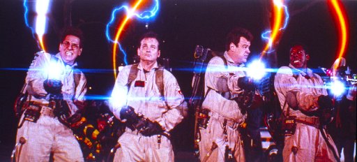
In an interview with Edgar Delgado on the PaperWings podcast, Edgar commented on how visual contrast in texture and color had been used in films such as Ghostbusters and the original Star Wars trilogy, but this crucial element had been forgotten in later follow-ups. He pointed out that in Ghostbusters‘ New York, there was no sun. It was a world of the dim, drab, and subdued. That is, until those proton packs came out, and the color and light of those streams lit up the screen! Without being told, the audience was immediately notified of how special, how magical, how powerful these objects were. And when we were told that crossing those streams would be “bad” – we believed it!!
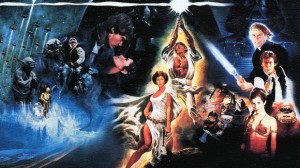
The same was true to the original Star Wars trilogy. The world was plainer, whether on dusty Tatooine or murky Dagobah. When those light-sabers came out, in their bright red and blue, you knew that there was something otherworldly there. On a subconscious level, it made this pseudo-mystical Force more believable than any hand-waving babble about Midi-chlorians. (We could also talk about the contrasts between the organic rebel locations and the stark Empire’s locations, but that’s a whole other discussion!) Edgar pointed out that this contrast was NOT observed in the newer films. “I remember the first time I saw the Naboo ships and they were all yellow…I thought ‘They’re making a really big mistake here’…they stand out so much and they’re not important…When I saw the trailer that was my first concern…Everybody says that the prequels don’t look like Star Wars…the design of the lightning and color is too bright. The other movies were more earthy, brown and gray tones, to contrast with all the colors of the cool stuff.”
By removing contrast, the newer films bombard our contrast-sensitive minds with signals that tell us EVERYTHING is important, even when it’s complete inconsequential. Much like a film comprised of nothing but explosions (I’m looking at you, Michael Bay) or a sentence filled a!t random! with !exc!amation point!s!! the meaning of those visual cues is lost. To make sense of what we’re seeing, we start to filter these cues out, draining them of their power and emotionally distancing ourselves from the story in the process. It becomes a sea of noise and spectacle. A passing distraction, but not an meaningful or engaging experience.
Creating Emotional Responses
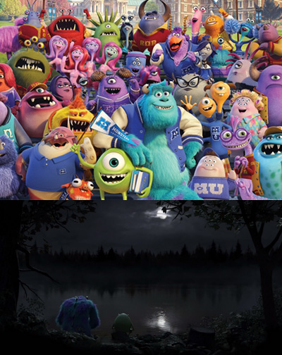
There are other films that use contrast to achieve different kinds of emotional responses. Star Wars and Ghostbusters both used contrasts to create a sense of awe, but other films have utilized contrast for entirely different purposes. Pixar’s Monsters Inc. and Monsters University use contrast to make our world, a place that SHOULD be comfortably familiar, into something threatening. The monster’s world is bright, vibrant, and sunny. It feels incredibly alive and welcoming. The human world, by contrast, is dim. Shadows are deep and looming. Leeched of color. Obscured in dust and mist. You understand why, from the monster’s point of view, humans are considered toxic and dangerous.
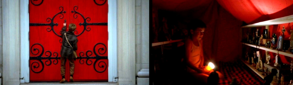
A story doesn’t have to be obvious about its visual contrast to have an impact, either. The Sixth Sense is famous for its use of red to indicate a connection with the supernatural. Here again, the world is fairly pale and shadowed. So slip in a red church door, a balloon, a carpet, a sweater, a tent, a door-knob, a dress, a shawl. All mundane items, given an otherworldly, and often somewhat sinister or threatening, connection. These are items touched by the dead. Although your conscious mind may not notice it the first time through, unconsciously you may find yourself paying attention to that color when it appears on the screen with a little shiver up your spine.
Utilizing a Lack of Contrast
A LACK of visual contrast can also be a tool in the storyteller’s hands, when used deliberately and with forethought. Satoshi Kon’s animated film Paprika has several scenes of dreams-gone-wrong. It is a massive bombardment of bright colors and motion. Confetti streams down from the sky, red torii gates tromp next to frogs and refrigerators. Piles of garishly colored dolls form a lumbering throne. The color combination, combined with the frenetic soundtrack, create a sensation of overwhelming chaos and unease. Here, unlike in the Star Wars prequels, the this-is-special contrast filter is purposefully overloaded, and the result is downright disturbing. Just as it was intended.

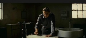
The film Inception goes the opposite direction, making the real world feel very much like the dream world. Cob runs from shadowy, generic foes through claustrophobic spaces, his waking world just as intimidating and desperate as the designed dreams he walks in. His children are sun-lit and distant figures when he enters his home, just as they’d been in his dreams, so when the image cuts just as the top begins to wobble, the audience has an immediate (and often furious, in the case of the theater I was in) reaction. Because there is just enough doubt there to make us wonder what is real. Doubt that exists, because of a lack of contrast. (As a side note, I find it interesting that the two best examples I can think of for purposeful contrast removal are from movies that focus heavily on dreams. Coincidence…? A thought for further pondering…)
In my own work
 In LeyLines, I’ve worked to introduce contrast between the normal world and the Dreaming pockets Mizha creates. Anything from the real world is drawn in ink, but all the Dreaming elements are drawn and shaded in pencil alone. Even when both real and Dreaming characters are present on the page, this subtle difference lets you know what belongs there, and what does not.
Visual contrast can push the information and mood that an audience experiences to a much more intense level. You are drawing them into the story you’re telling by using their natural sensitivity to contrast to highlight important elements, develop moods, and convey information without the use of words. This lets the audience come to your story on their own terms, and they’ll be more engaged for it!